Colours act in a multitude of ways. They help evoke certain moods, apart from having personalities of their own. One can match every room’s colours to suit personal desires, tastes and even to enhance the room’s purpose. Light colours are airy, making rooms seem larger and brighter. Dark colours are warm, giving large rooms a more intimate appearance. Certain colours create an atmosphere of energy and others allow their beholder to sink back and relax.
Let’s take a closer look at colours and learn what they can do to a room, as we get you a healthy living guide to colour therapy for your home.
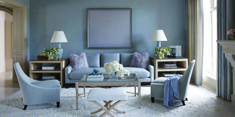
Blue is said to lower blood pressure and even out respiration. That is why it is considered calming, and is often recommended for bedrooms and bathrooms, particularly in softer shades. To encourage relaxation in social areas such as family rooms, living rooms, consider warmer blues, such as periwinkle, or bright blues, such as cerulean or turquoise. Some people find indigo helpful for studying so this colour could be used as part of the decor of a library or study.

Green is considered the most restful for the eyes. Combining the rejuvenating quality of blue and the cheerfulness of yellow, green is suited for almost any room in the house. In the kitchen, green cools things down; in a family room or living room, it encourages relaxation but has enough warmth to promote comfort and intimacy. Depending upon the shade, it can be used for most areas.
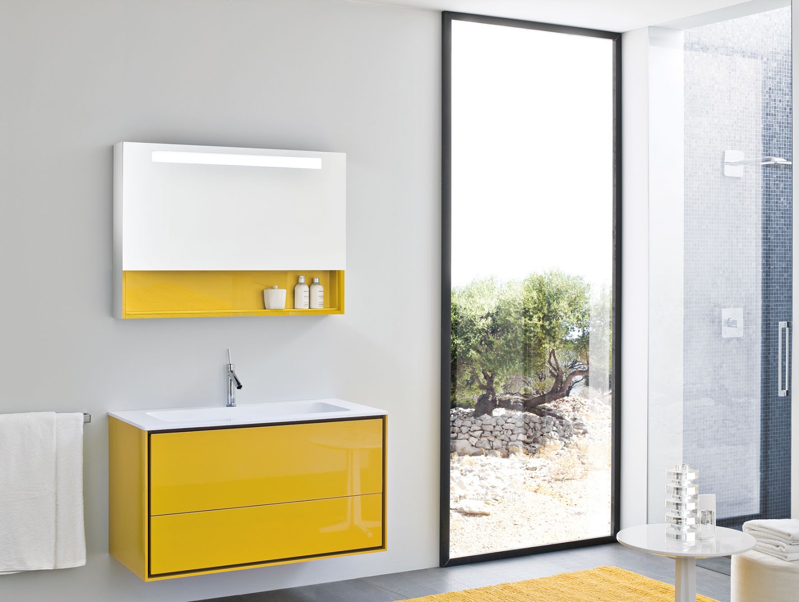
Yellow captures the joy of sunshine and communicates happiness. It is an excellent choice for kitchens, dining rooms and bathrooms, where it is energising and uplifting. In halls, entries and smaller spaces, yellow can feel expansive and welcoming. The colour is believed to stimulate the nerves and purify the body, but too much of it can get cloying. Yellow tends to keep one’s mind engaged and is a good choice for a study room, but given its tendency to keep the brain ticking, using it in the bedroom could adversely affect sleep.
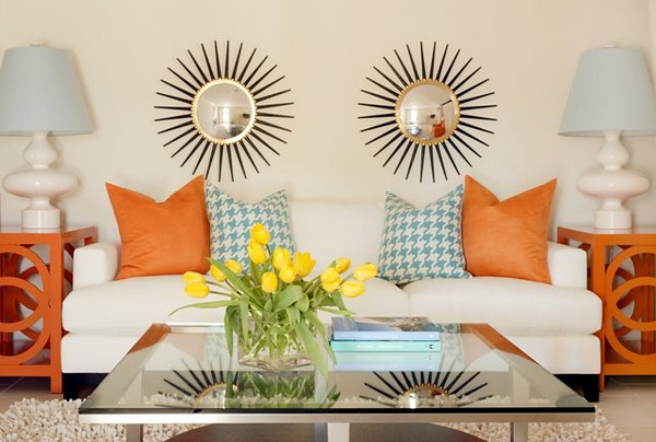
Orange evokes excitement and enthusiasm, and is an energetic colour. In ancient cultures, orange was believed to heal the lungs and increase energy levels. While not a good idea for a living room or for bedrooms, this colour is excellent for an exercise room as it can help stimulate the release of stress during a fitness routine. It can look great when teamed up as a accent colour though. Usually orange should be used in areas of activity and even creative pursuits. Try going for a coral shade if teaming up with other pastel colours.
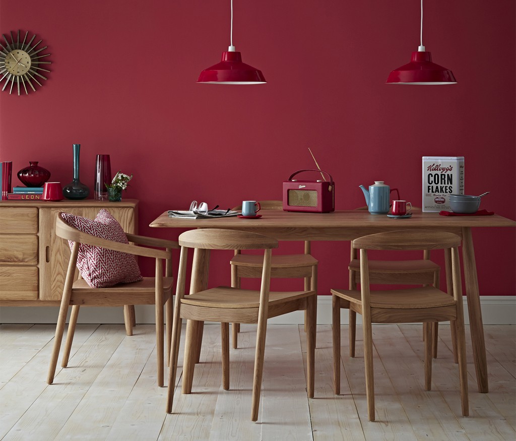
Red raises a room’s energy level. Its intensity helps pump the adrenaline and it is a good choice for when you want to stir up excitement. In a living room or dining room, red draws people together and stimulates conversation. In an entryway, it creates a strong first impression. Used well, red and its variations can make a space feel warm and inviting. However, it needs careful choice of tone and depth, as it can easily become oppressive by making a space look smaller.
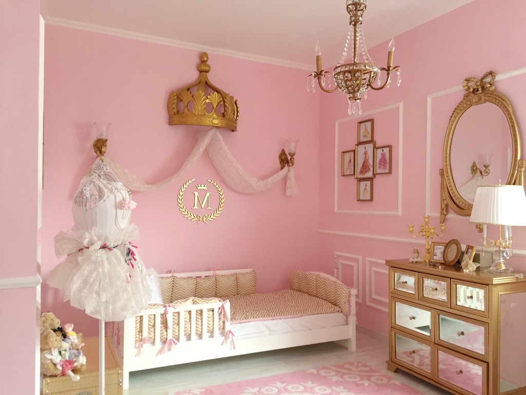
Shades of Pink such as fun bubble-gum, bright coral and traditional rose add a feminine touch to any room, a favourite for baby girl nurseries. This colour soothes and nurtures. It helps to dissolve anger and encourages feelings of love, so it is an ideal choice for a bedroom. Pink accents used in bathrooms also help soften the atmosphere and make baths more relaxing!
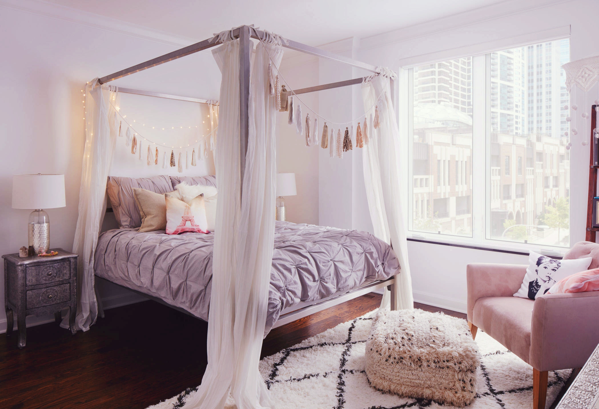
Purple, in its darkest shades (eggplant, for example), is rich, dramatic and sophisticated. It is associated with luxury and creativity and makes a room look plush. As an accent or secondary colour, it gives depth to a scheme. Lighter versions of purple, such as lavender and lilac, bring the same restful quality to bedrooms as blue does, but without the risk of feeling frosty.
Neutrals (black, grey, white and brown) are essential to any decorator’s tool kit. Neutrals are not always ideal as single colours, but when used with care, they can enhance and complement other colours in almost any situation. One can add other colours to neutrals to liven them up and conversely subtract them to calm things down. On the other hand, all-neutral schemes might fall in and out of fashion, but their virtue lies in their flexibility and classic appeal.
Expert advice: As much as you may like a colour do ask your interior designer or painter to get you a fan deck for that exact shade. Since many colours may vary depending upon the amount of sunlight in the room. You can easily get a colour fan deck from brands like Asian Paints, Dulux, Burger or Kansai Nerolac Ltd.